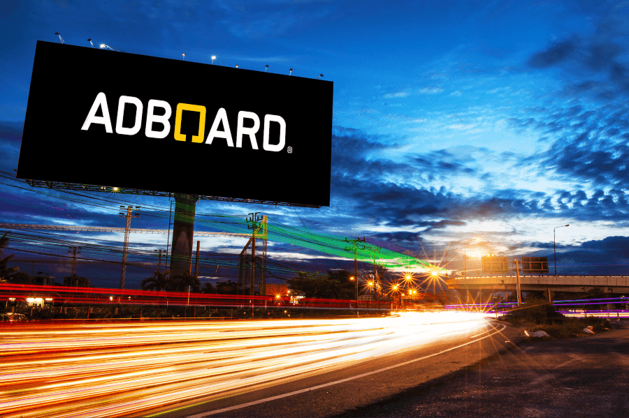
The 3 Must-Haves for Outdoor Advertising

You have one fleeting chance to get your message across to your viewer on an average billboard – a visibility window which oftentimes is a mere second or two. Despite this narrow timeframe for impact, the proliferation of outdoor advertising is prevalent and should be ignored only at a good marketer’s peril. Outdoor Advertising’s omnipresence is a fact which is not likely to change any time soon, which means that if you want to create cutting edge impact which converts a viewer into a customer, you must look towards this medium.
Where you decide to implement a large-scale outdoor advertising strategy, these are the three things you must consider and get right in order to maximize your chances for success:
1. DETAIL YOUR LOCATION
Subtlety in design and placement can generate standout status when it comes to outdoor advertising – an odd size, spec or location can elicit a closer and more studied look by a viewer so it is important to handle all details mindfully. Placement being the biggest detail of all – knowing where the high-traffic areas are, what kind of audience/ demographic is in the area, and being aware of any specific positioning x-factors e.g. placing a billboard directly on top of a building.
Highlight Tip: Place pertinent information like a logo in a position which renders it visible to everybody from all angles. Moving traffic can obscure important imagery like website details so make sure to never place essential information along the bottom of your billboard.
2. HOLY TRIO
In all design compositions, odd numbers have been shown to work best, while avoiding visual clutter is also key. Generally speaking, the most successful outdoor designs contain 3 main elements that allow the viewer’s eye to move quickly and easily through a hierarchy of information. Designers should avoid cramming too many photos together, inserting overly distracting backgrounds, and using verbose type or multiple logos in one ad. Simply put, the more you ‘have’ on your billboard, the more it will be overlooked – keep is simple and keep it to a maximum of three main elements.
Highlight Tip: An amusing but succinct headline is a powerful tool to catch the attention of a viewer – hold that attention by following with a large, appealing product image and then your brand logo. These three elements, presented within a design landscape that allows for plenty of visual ‘breathing room’ is a guaranteed recipe for the successful conveyance of your message. Final warning: a line of type that goes beyond 5-6 words is too long.
3. BREVITY
Even though there are usually up to 6 or more touch points that can drive your message home beyond an outdoor ad, it is nonetheless an extremely impactful medium encapsulated in an average view of a mere 3.5 seconds. Within such a narrow window, avoid having half your ad space monopolized by all caps, as you will end up losing the emphasis you were hoping to achieve and instead start YELLING at your viewer. Examples are rife of billboards shouting at drivers in all caps while they whiz by at 70km/h on the highway – trying to convey messages which are just as swiftly dismissed by those they are trying to target. Even if you are a speed-reader, with 20/20 vision and the best safety record in the world, your attention span for outdoor advertising will be limited to a few seconds so it is absolutely necessary that marketers convey messaging clearly and concisely. Keep your background clean and simple. Use bold colors and contrast, but avoid distracting florescent colors or large swaths of empty white space. Make it easy on the eyes. Where you are dealing with a jumbo-sized space, make sure to keep the text and images large enough to fit well within the expanse.
Highlight Tip: Try to convey a singularly clear and concise message to your audience – a message which is encapsulated in one cohesive design. Remember, you only have a brief window of opportunity to get your point across, so avoid cluttering your ad space with too much type, too many photos, conflicting artwork, etc. – where people may see your ad from several hundred meters away, makes sure to maximize your visibility window with a message that can be seen from an extended distance.
A final caution to all marketers – keep in mind that your viewer is also likely, though unconsciously, judging your efficiency, professionalism, and service delivery quality when looking at your design. If the design is sloppy and they are left hoping your service is better than your billboard design, you’ve lost the game before it has even started. Avoid design pitfalls by streamlining your message and keeping things simple: leave off that secondary call to action, the list of bullet points, special bonus offers, etc. Instead keep the messaging clear by adhering to the 3 elements rule and never forget the audience that you are targeting.
